On-screen QWERTY keyboard that drives one text input at a time. More...
#include <Keyboard.h>
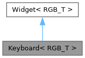
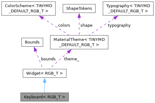
Public Member Functions | |
| Keyboard ()=default | |
| Keyboard (Bounds bounds) | |
| template<typename Field > | |
| void | manage (Field &field) |
| void | hide () |
| void | draw (tinygpu::ISurface< RGB_T > &target) override |
| bool | onGesture (const tinygpu::GestureEvent &event) override |
| Handles one gesture event. Returns true if this widget consumed it. | |
 Public Member Functions inherited from Widget< RGB_T > | |
| virtual | ~Widget ()=default |
| virtual void | setTheme (const MaterialTheme< RGB_T > &theme) |
| virtual void | draw (tinygpu::ISurface< RGB_T > &target)=0 |
| virtual bool | onGesture (const tinygpu::GestureEvent &event) |
| Handles one gesture event. Returns true if this widget consumed it. | |
| virtual bool | update (uint32_t nowMs) |
| virtual bool | isDraggable () const |
| virtual bool | isDraggableAt (int32_t x, int32_t y) const |
| virtual int | childCount () const |
| virtual Widget< RGB_T > * | child (int index) |
| virtual void | drawBackground (tinygpu::ISurface< RGB_T > &target) |
| virtual void | setThemeTint (RGB_T background, RGB_T foreground) |
| virtual bool | isContainer () const |
| Provides true if the widget is a container. | |
Additional Inherited Members | |
| Public Attributes inherited from Widget< RGB_T > | |
| Bounds | bounds |
| bool | visible = true |
| bool | enabled = true |
| Protected Member Functions inherited from Widget< RGB_T > | |
| const MaterialTheme< RGB_T > & | theme () const |
| Convenience accessor for draw() overrides - see theme_. | |
| Protected Attributes inherited from Widget< RGB_T > | |
| const MaterialTheme< RGB_T > * | theme_ = nullptr |
Detailed Description
class tinymd::Keyboard< RGB_T >
On-screen QWERTY keyboard that drives one text input at a time.
A single Keyboard instance can serve any number of fields, TextField and TextArea interchangeably (see Core/TextInputTarget.h) - call manage(field) once per field to wire it up:
Keyboard<RGB565> keyboard(Bounds(0, 420, 340, 190)); keyboard.manage(nameField); // TextField keyboard.manage(notesField); // TextArea
manage() makes tapping a field show this keyboard targeted at it (and blur whichever field it was previously targeting). Add the keyboard to Screen after every field it manages, so it draws (and hit-tests) on top of them while shown.
Layout: a numbers row (which also holds the "123"/"ABC" key), three rows that switch between QWERTY letters and a page of common symbols (!#$%^&*() / -_=+[]{}\ / ;:'",./), and a control row (Shift / Space / Enter / Backspace / Done). Shift is a toggle (caps-lock style, not "one letter then auto-revert") and has no effect on the symbols page. Enter and Done are deliberately separate keys: Enter always inserts a literal '\n' and moves to the next line, regardless of field type; Done always means "finished editing" and closes the keyboard (see TextInputTarget:: handleEnter(), which every field implements to return true) - so on a TextArea, Enter adds a line without leaving the keyboard, and Done closes it whenever you're actually done, mid-line or not. There is only this one symbols page (no further "more symbols" page) - a deliberate cut to keep this a two-layer keyboard rather than a deeper multi-page one.
Constructor & Destructor Documentation
◆ Keyboard() [1/2]
|
default |
◆ Keyboard() [2/2]
Member Function Documentation
◆ draw()
|
inlineoverridevirtual |
Renders the widget into target using colors/fonts/tokens from its own theme (see theme()/setTheme()).
Implements Widget< RGB_T >.
◆ hide()
|
inline |
◆ manage()
|
inline |
Wires field so tapping it shows this keyboard targeted at it. Field must implement TextInputTarget and expose a public std::function<void()> onFocus - true of both TextField and TextArea.
◆ onGesture()
|
inlineoverridevirtual |
Handles one gesture event. Returns true if this widget consumed it.
Reimplemented from Widget< RGB_T >.
The documentation for this class was generated from the following file:
- src/TinyMaterialDesign/Widgets/Keyboard.h