Single-line text input box. More...
#include <TextField.h>
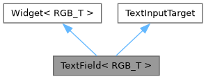
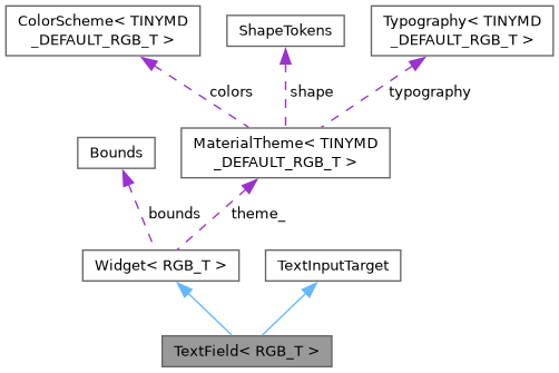
Public Member Functions | |
| TextField ()=default | |
| TextField (Bounds bounds, const char *label=nullptr, const char *placeholder=nullptr) | |
| void | setInputType (InputType type) |
| InputType | inputType () const override |
| The kind of input - Keyboard picks its layout from it. Default: text. | |
| void | setError (const char *text) |
| bool | hasError () const |
| const std::string & | errorText () const |
| void | setValidator (std::function< bool(const std::string &)> valid, const char *errorText) |
| bool | isValid () const |
| True if there is no validator or it accepts the text. | |
| void | setPasswordMode (bool password) |
| bool | passwordMode () const |
| void | setOnBackground (bool onBackground) |
| const std::string & | text () const |
| void | setText (const char *text) |
| void | setMaxLength (size_t maxLength) |
| 0 (the default) means unlimited. | |
| bool | focused () const |
| void | focus () |
| void | blur () override |
| void | insertChar (char c) override |
| void | backspace () override |
| void | submit () |
| bool | handleEnter () override |
| void | draw (tinygpu::ISurface< RGB_T > &target) override |
| bool | onGesture (const tinygpu::GestureEvent &event) override |
| Handles one gesture event. Returns true if this widget consumed it. | |
| bool | update (uint32_t nowMs) override |
 Public Member Functions inherited from Widget< RGB_T > | |
| virtual | ~Widget ()=default |
| virtual void | setTheme (const MaterialTheme< RGB_T > &theme) |
| virtual void | draw (tinygpu::ISurface< RGB_T > &target)=0 |
| virtual bool | onGesture (const tinygpu::GestureEvent &event) |
| Handles one gesture event. Returns true if this widget consumed it. | |
| virtual bool | update (uint32_t nowMs) |
| virtual bool | isDraggable () const |
| virtual bool | isDraggableAt (int32_t x, int32_t y) const |
| virtual int | childCount () const |
| virtual Widget< RGB_T > * | child (int index) |
| virtual void | drawBackground (tinygpu::ISurface< RGB_T > &target) |
| virtual void | setThemeTint (RGB_T background, RGB_T foreground) |
| virtual bool | isContainer () const |
| Provides true if the widget is a container. | |
| Public Member Functions inherited from TextInputTarget | |
| virtual | ~TextInputTarget ()=default |
| virtual InputType | inputType () const |
| The kind of input - Keyboard picks its layout from it. Default: text. | |
| virtual void | insertChar (char c)=0 |
| virtual void | backspace ()=0 |
| virtual void | blur ()=0 |
| virtual bool | handleEnter ()=0 |
Public Attributes | |
| std::function< void()> | onFocus |
| std::function< void(const std::string &)> | onChange |
| Fired after every character insertion/deletion. | |
| std::function< void()> | onSubmit |
| Fired when a Keyboard's Enter/Done key (or submit()) is pressed. | |
| std::function< void()> | onBlur |
| Public Attributes inherited from Widget< RGB_T > | |
| Bounds | bounds |
| bool | visible = true |
| bool | enabled = true |
Additional Inherited Members | |
| Protected Member Functions inherited from Widget< RGB_T > | |
| const MaterialTheme< RGB_T > & | theme () const |
| Convenience accessor for draw() overrides - see theme_. | |
| Protected Attributes inherited from Widget< RGB_T > | |
| const MaterialTheme< RGB_T > * | theme_ = nullptr |
Detailed Description
class tinymd::TextField< RGB_T >
Single-line text input box.
TextField only holds and displays text and focus state - it has no idea how to turn touches into characters. Pair it with a Keyboard (Keyboard.h):
Keyboard<RGB565> keyboard(Bounds(0, 420, 340, 190)); TextField<RGB565> nameField(Bounds(16, 88, 220, 48), "Name"); keyboard.manage(nameField); // wires nameField's focus to this keyboard screen.addWidget(nameField); screen.addWidget(keyboard); // add last so it draws on top when shown
insertChar()/backspace()/handleEnter() (TextInputTarget, see Core/ TextInputTarget.h) are what let a Keyboard - or any other input source - drive a focused field without TextField needing to know about it. Enter submits (see TextArea.h for the multi-line counterpart, where Enter inserts a newline instead).
Bounds is split internally into a small label strip (top) and the input box itself (the rest) - both are part of this widget's own bounds, so a tap anywhere in either area focuses the field.
Known limitation: text longer than the box is drawn past its right edge rather than scrolling/clipping - TinyGPU's fonts have no sub-rect clip, only surface-edge clipping. Fine for short inputs (names, search terms, ...); not meant for long free-form text.
Constructor & Destructor Documentation
◆ TextField() [1/2]
|
default |
◆ TextField() [2/2]
|
inline |
Member Function Documentation
◆ backspace()
|
inlineoverridevirtual |
Implements TextInputTarget.
◆ blur()
|
inlineoverridevirtual |
Implements TextInputTarget.
◆ draw()
|
inlineoverridevirtual |
Renders the widget into target using colors/fonts/tokens from its own theme (see theme()/setTheme()).
Implements Widget< RGB_T >.
◆ errorText()
|
inline |
◆ focus()
|
inline |
◆ focused()
|
inline |
◆ handleEnter()
|
inlineoverridevirtual |
TextInputTarget: single-line semantics - Enter submits and tells the Keyboard to hide itself.
Implements TextInputTarget.
◆ hasError()
|
inline |
◆ inputType()
|
inlineoverridevirtual |
The kind of input - Keyboard picks its layout from it. Default: text.
Reimplemented from TextInputTarget.
◆ insertChar()
|
inlineoverridevirtual |
Appends one character - called by whatever is driving text entry (typically a Keyboard key tap).
Implements TextInputTarget.
◆ isValid()
|
inline |
True if there is no validator or it accepts the text.
◆ onGesture()
|
inlineoverridevirtual |
Handles one gesture event. Returns true if this widget consumed it.
Reimplemented from Widget< RGB_T >.
◆ passwordMode()
|
inline |
◆ setError()
|
inline |
Shows the field in the error color with text as supporting text below the box (it needs 14 px of the bounds); nullptr or "" clears the error.
◆ setInputType()
|
inline |
kNumber: only digits (and . - + :) are accepted and a Keyboard shows its numeric keypad.
◆ setMaxLength()
|
inline |
0 (the default) means unlimited.
◆ setOnBackground()
|
inline |
The field is directly on a page: the label above the box (and the error text below it) are drawn on the theme's background color instead of the surface color.
◆ setPasswordMode()
|
inline |
Shows a '*' for each character (e.g. for a password); text() still returns the real text.
◆ setText()
|
inline |
◆ setValidator()
|
inline |
Checks the text after each change: if valid returns false the field shows errorText (see setError()).
◆ submit()
|
inline |
Loses focus and fires onSubmit - called directly, or via a Keyboard's Enter/Done key through handleEnter().
◆ text()
|
inline |
◆ update()
|
inlineoverridevirtual |
Called once per frame, before draw(), to advance any time-based animation (ripple fade, indeterminate progress sweep, ...). Returns true if that advance changed anything this widget will draw differently, so Screen can decide whether a redraw is actually needed - see Screen::isDirty(). Default: no-op, not dirty, so widgets that don't animate cost nothing extra.
Reimplemented from Widget< RGB_T >.
Member Data Documentation
◆ onBlur
| std::function<void()> onBlur |
◆ onChange
| std::function<void(const std::string&)> onChange |
Fired after every character insertion/deletion.
◆ onFocus
| std::function<void()> onFocus |
◆ onSubmit
The documentation for this class was generated from the following file:
- src/TinyMaterialDesign/Widgets/TextField.h