Material Design button: Filled / Tonal / Outlined / Text / Elevated. More...
#include <Button.h>
Public Member Functions | |
| Button ()=default | |
| Button (Bounds bounds, const char *label, ButtonVariant variant=ButtonVariant::kFilled) | |
| void | setLabel (const char *label) |
| const std::string & | label () const |
| void | setVariant (ButtonVariant variant) |
| void | draw (tinygpu::ISurface< RGB_T > &target) override |
| bool | onGesture (const tinygpu::GestureEvent &event) override |
| Handles one gesture event. Returns true if this widget consumed it. | |
| bool | update (uint32_t nowMs) override |
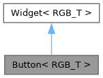
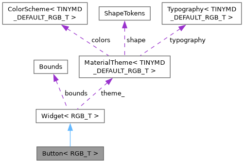
 Public Member Functions inherited from Widget< RGB_T > | |
| virtual | ~Widget ()=default |
| virtual void | setTheme (const MaterialTheme< RGB_T > &theme) |
| virtual void | draw (tinygpu::ISurface< RGB_T > &target)=0 |
| virtual bool | onGesture (const tinygpu::GestureEvent &event) |
| Handles one gesture event. Returns true if this widget consumed it. | |
| virtual bool | update (uint32_t nowMs) |
| virtual bool | isDraggable () const |
| virtual bool | isDraggableAt (int32_t x, int32_t y) const |
| virtual int | childCount () const |
| virtual Widget< RGB_T > * | child (int index) |
| virtual void | drawBackground (tinygpu::ISurface< RGB_T > &target) |
| virtual void | setThemeTint (RGB_T background, RGB_T foreground) |
| virtual bool | isContainer () const |
| Provides true if the widget is a container. | |
Public Attributes | |
| std::function< void()> | onClick |
| Public Attributes inherited from Widget< RGB_T > | |
| Bounds | bounds |
| bool | visible = true |
| bool | enabled = true |
Additional Inherited Members | |
| Protected Member Functions inherited from Widget< RGB_T > | |
| const MaterialTheme< RGB_T > & | theme () const |
| Convenience accessor for draw() overrides - see theme_. | |
| Protected Attributes inherited from Widget< RGB_T > | |
| const MaterialTheme< RGB_T > * | theme_ = nullptr |
Detailed Description
class tinymd::Button< RGB_T >
Material Design button: Filled / Tonal / Outlined / Text / Elevated.
Tap feedback is the (optional) ripple grown from the tap point - real touch drivers only report a recognized, completed tap (GestureType::kTap), not a raw finger-down instant, so the ripple is the button's touch feedback rather than a separate immediate "pressed" shade.
Constructor & Destructor Documentation
◆ Button() [1/2]
|
default |
◆ Button() [2/2]
|
inline |
Member Function Documentation
◆ draw()
|
inlineoverridevirtual |
Renders the widget into target using colors/fonts/tokens from its own theme (see theme()/setTheme()).
Implements Widget< RGB_T >.
◆ label()
|
inline |
◆ onGesture()
|
inlineoverridevirtual |
Handles one gesture event. Returns true if this widget consumed it.
Reimplemented from Widget< RGB_T >.
◆ setLabel()
|
inline |
◆ setVariant()
|
inline |
◆ update()
|
inlineoverridevirtual |
Called once per frame, before draw(), to advance any time-based animation (ripple fade, indeterminate progress sweep, ...). Returns true if that advance changed anything this widget will draw differently, so Screen can decide whether a redraw is actually needed - see Screen::isDirty(). Default: no-op, not dirty, so widgets that don't animate cost nothing extra.
Reimplemented from Widget< RGB_T >.
Member Data Documentation
◆ onClick
| std::function<void()> onClick |
The documentation for this class was generated from the following file:
- src/TinyMaterialDesign/Widgets/Button.h