Multi-line text that is wrapped at word boundaries to the widget width ('
' starts a new line) - for notes, explanations and messages. Unlike Label it can span several lines; heightFor() tells how much room the text needs, so a layout can size the widget to its text:
More...
#include <TextBlock.h>
Public Member Functions | |
| TextBlock ()=default | |
| TextBlock (const char *text, TypographyRole role=TypographyRole::kLabel) | |
| TextBlock (Bounds bounds, const char *text, TypographyRole role=TypographyRole::kLabel) | |
| void | setText (const char *text) |
| const std::string & | text () const |
| void | setRole (TypographyRole role) |
| void | setColor (RGB_T color) |
| void | clearColor () |
| void | setOnSurface (bool onSurface) |
| Draw on a surface (e.g. inside a Card) instead of the page background. | |
| void | setLineSpacing (int32_t pixels) |
| Extra pixels between the lines. | |
| void | draw (tinygpu::ISurface< RGB_T > &target) override |
| int32_t | heightFor (int32_t width) const |
| Height that the text needs at the given width (needs the theme). | |
 Public Member Functions inherited from Widget< RGB_T > | |
| virtual | ~Widget ()=default |
| virtual void | setTheme (const MaterialTheme< RGB_T > &theme) |
| virtual void | draw (tinygpu::ISurface< RGB_T > &target)=0 |
| virtual bool | onGesture (const tinygpu::GestureEvent &event) |
| Handles one gesture event. Returns true if this widget consumed it. | |
| virtual bool | update (uint32_t nowMs) |
| virtual bool | isDraggable () const |
| virtual bool | isDraggableAt (int32_t x, int32_t y) const |
| virtual int | childCount () const |
| virtual Widget< RGB_T > * | child (int index) |
| virtual void | drawBackground (tinygpu::ISurface< RGB_T > &target) |
| virtual void | setThemeTint (RGB_T background, RGB_T foreground) |
| virtual bool | isContainer () const |
| Provides true if the widget is a container. | |
Static Public Member Functions | |
| static int32_t | lineCount (const std::string &text, int32_t width, tinygpu::IFont< RGB_T > &font) |
Number of lines of text wrapped to width with font. | |
| template<typename Fn > | |
| static void | forEachLine (const std::string &text, int32_t width, tinygpu::IFont< RGB_T > &font, Fn fn) |
Calls fn(line) for each line of text wrapped to width. | |
Additional Inherited Members | |
| Public Attributes inherited from Widget< RGB_T > | |
| Bounds | bounds |
| bool | visible = true |
| bool | enabled = true |
| Protected Member Functions inherited from Widget< RGB_T > | |
| const MaterialTheme< RGB_T > & | theme () const |
| Convenience accessor for draw() overrides - see theme_. | |
| Protected Attributes inherited from Widget< RGB_T > | |
| const MaterialTheme< RGB_T > * | theme_ = nullptr |
Detailed Description
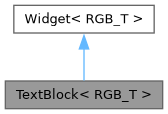
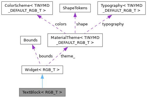
class tinymd::TextBlock< RGB_T >
Multi-line text that is wrapped at word boundaries to the widget width ('
' starts a new line) - for notes, explanations and messages. Unlike Label it can span several lines; heightFor() tells how much room the text needs, so a layout can size the widget to its text:
TextBlock<RGB565> note(Bounds(8, y, 224, 0), "A long explanation ..."); page.addChild(note); // gives it the theme note.bounds.h = note.heightFor(note.bounds.w);
Default: label font, onSurfaceVariant color, drawn on the page background.
Constructor & Destructor Documentation
◆ TextBlock() [1/3]
|
default |
◆ TextBlock() [2/3]
|
inlineexplicit |
◆ TextBlock() [3/3]
|
inline |
Member Function Documentation
◆ clearColor()
|
inline |
◆ draw()
|
inlineoverridevirtual |
Renders the widget into target using colors/fonts/tokens from its own theme (see theme()/setTheme()).
Implements Widget< RGB_T >.
◆ forEachLine()
|
inlinestatic |
Calls fn(line) for each line of text wrapped to width.
◆ heightFor()
|
inline |
Height that the text needs at the given width (needs the theme).
◆ lineCount()
|
inlinestatic |
Number of lines of text wrapped to width with font.
◆ setColor()
|
inline |
◆ setLineSpacing()
|
inline |
Extra pixels between the lines.
◆ setOnSurface()
|
inline |
Draw on a surface (e.g. inside a Card) instead of the page background.
◆ setRole()
|
inline |
◆ setText()
|
inline |
◆ text()
|
inline |
The documentation for this class was generated from the following file:
- src/TinyMaterialDesign/Widgets/TextBlock.h