Rows for settings and detail pages: a caption combined with a control or a value. Each row is one widget, so a page only places rows from top to bottom. By default they are drawn on the page background; call setOnSurface(true) for rows inside a Card. More...
#include <math.h>#include <stdio.h>#include <functional>#include <string>#include "TinyMaterialDesign/Core/Widget.h"#include "TinyMaterialDesign/Widgets/RadioButton.h"#include "TinyMaterialDesign/Widgets/Slider.h"#include "TinyMaterialDesign/Widgets/Switch.h"
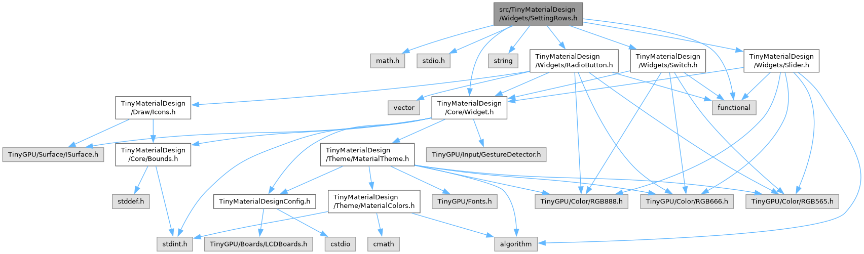
Include dependency graph for SettingRows.h:
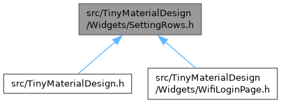
This graph shows which files directly or indirectly include this file:
Go to the source code of this file.
Classes | |
| class | SettingRow< RGB_T > |
| Common part of the rows: caption and background. More... | |
| class | SliderRow< RGB_T > |
Caption and formatted value on one line, a Slider below. The value is quantized to step: More... | |
| class | SwitchRow< RGB_T > |
| Caption on the left, Switch on the right; tapping the row toggles it. More... | |
| class | RadioRow< RGB_T > |
| RadioButton and caption; tapping the row selects it. More... | |
| class | KeyValueRow< RGB_T > |
| Key on the left, value on the right (label font). More... | |
Namespaces | |
| namespace | tinymd |
Detailed Description
Rows for settings and detail pages: a caption combined with a control or a value. Each row is one widget, so a page only places rows from top to bottom. By default they are drawn on the page background; call setOnSurface(true) for rows inside a Card.
- SliderRow: caption and formatted value, a Slider below (kHeight 40)
- SwitchRow: caption, Switch at the right; tapping the row toggles it
- RadioRow: RadioButton and caption; tapping the row selects it
- KeyValueRow: key at the left, value at the right